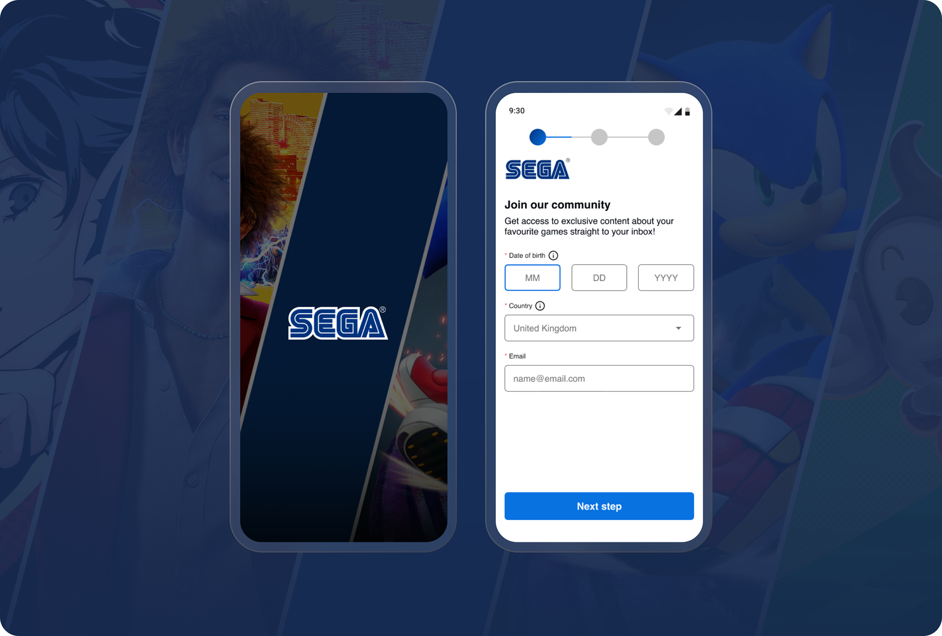
SEGA Sign up
SEGA's new sign-up form showcases a transformative approach to user registration, enhancing both functionality and user experience. By conducting thorough user research and usability testing, we identified pain points in the existing sign-up process and crafted a streamlined solution.
What we delivered
User interviews
Digital wireframes
Prototyping
Accessibility considerations
My role
This project was undertaken while I was UX/UI Designer at Spicerack from 2022-24.
The problem
Users trying to register for email newsletter but met with pain points because it’s not intuitive and accessible to all, leading to them to abandon the form.
The goal
We wanted to create a simple and frictionless user experience across all devices. With best practices and competitor analysis helping to improve conversion rates of user registrations.
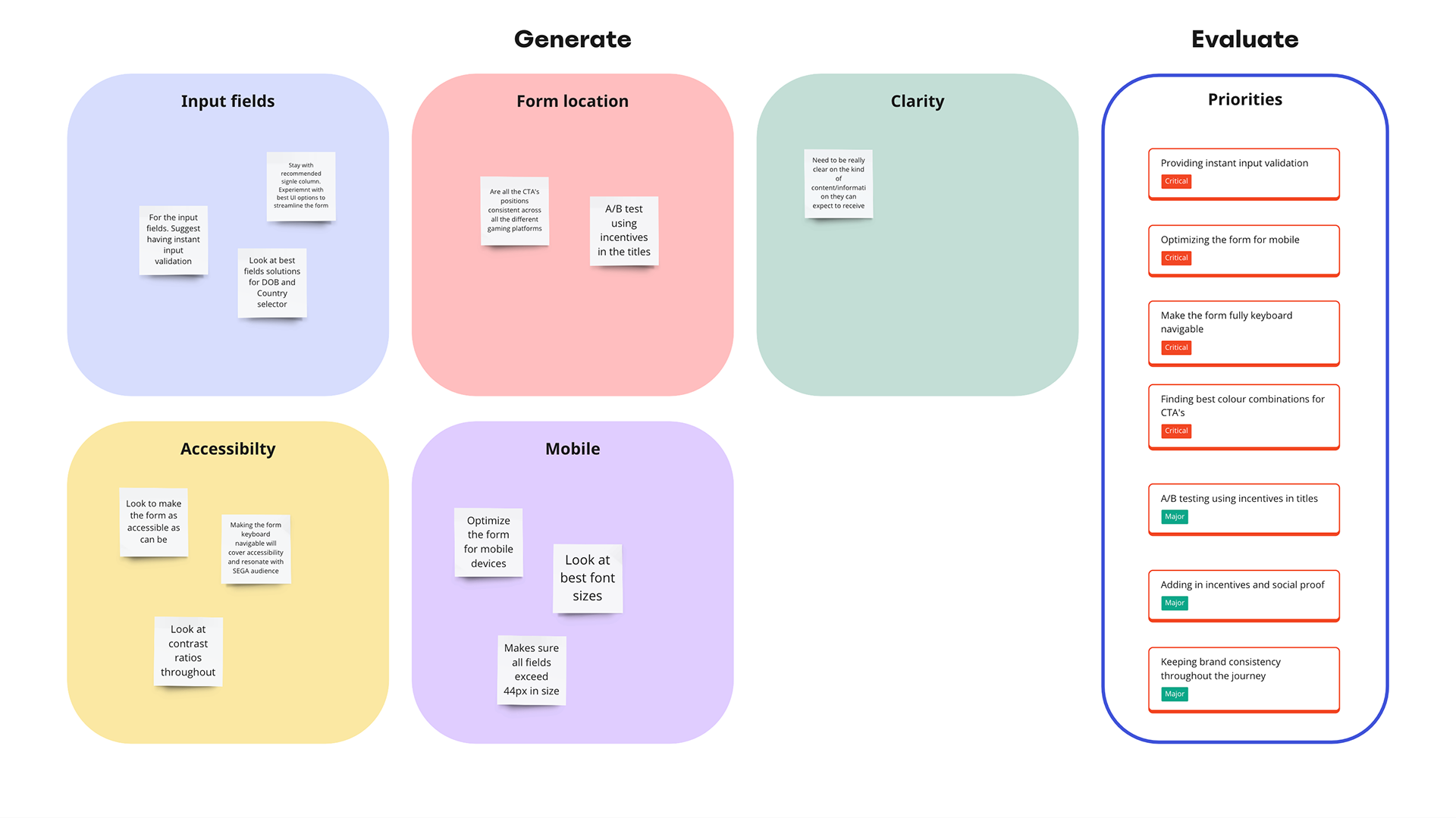
We used affinity maps for the new sign-up form to organise and synthesise user feedback, enabling us to identify patterns, prioritise insights, and inform the design decisions effectively.
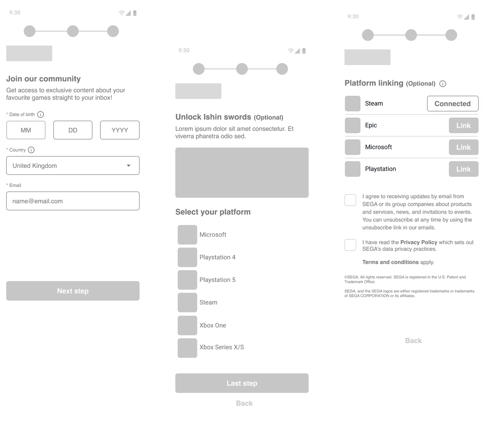
Wireframes
Taking the time to draft iterations off each screen of the app on paper ensured that the elements that made it to digital wireframes would be well-suited to address user pain points. For the home screen I prioritised a quick and easy booking process to help save time.
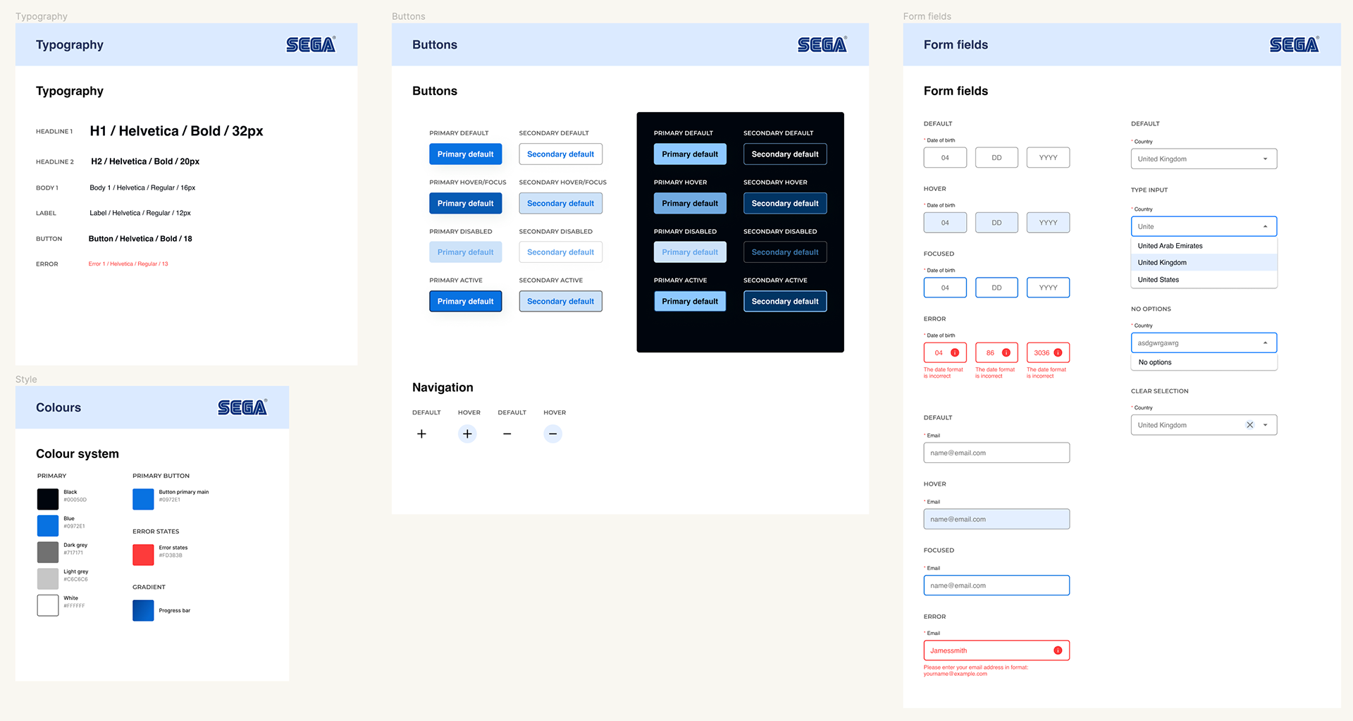
The design system for SEGA's new sign-up form ensures consistency in visual elements, interaction patterns, and branding across all user touchpoints, enhancing usability and reinforcing brand identity.
Multi-step and Single-form
We wanted to design both multi-step and single-form sign-up processes to cater to different user preferences and optimise the user experience based on various scenarios. A/B testing the sign-up forms empowers SEGA to make data-driven decisions, improve the user experience, and increase conversion rates, ultimately driving growth and success for the platform.
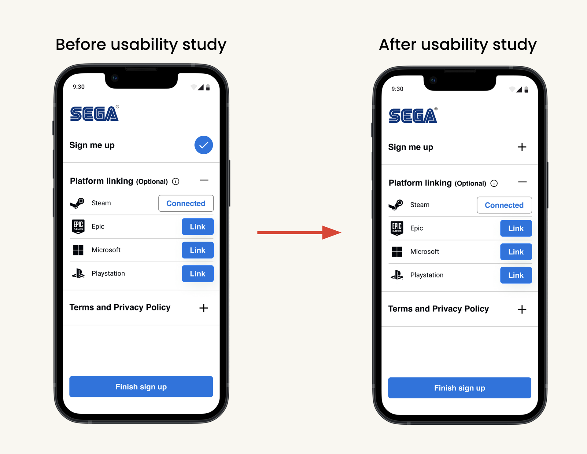
Refining the designs
In early designs a tick mark indicated completion of personal details section. Usability studies showed it wasn’t obvious to the user they could go back and edit those details. Removal of the completion ticks caused less confusion.
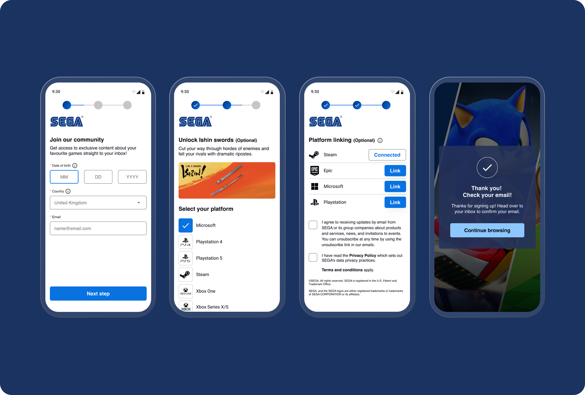
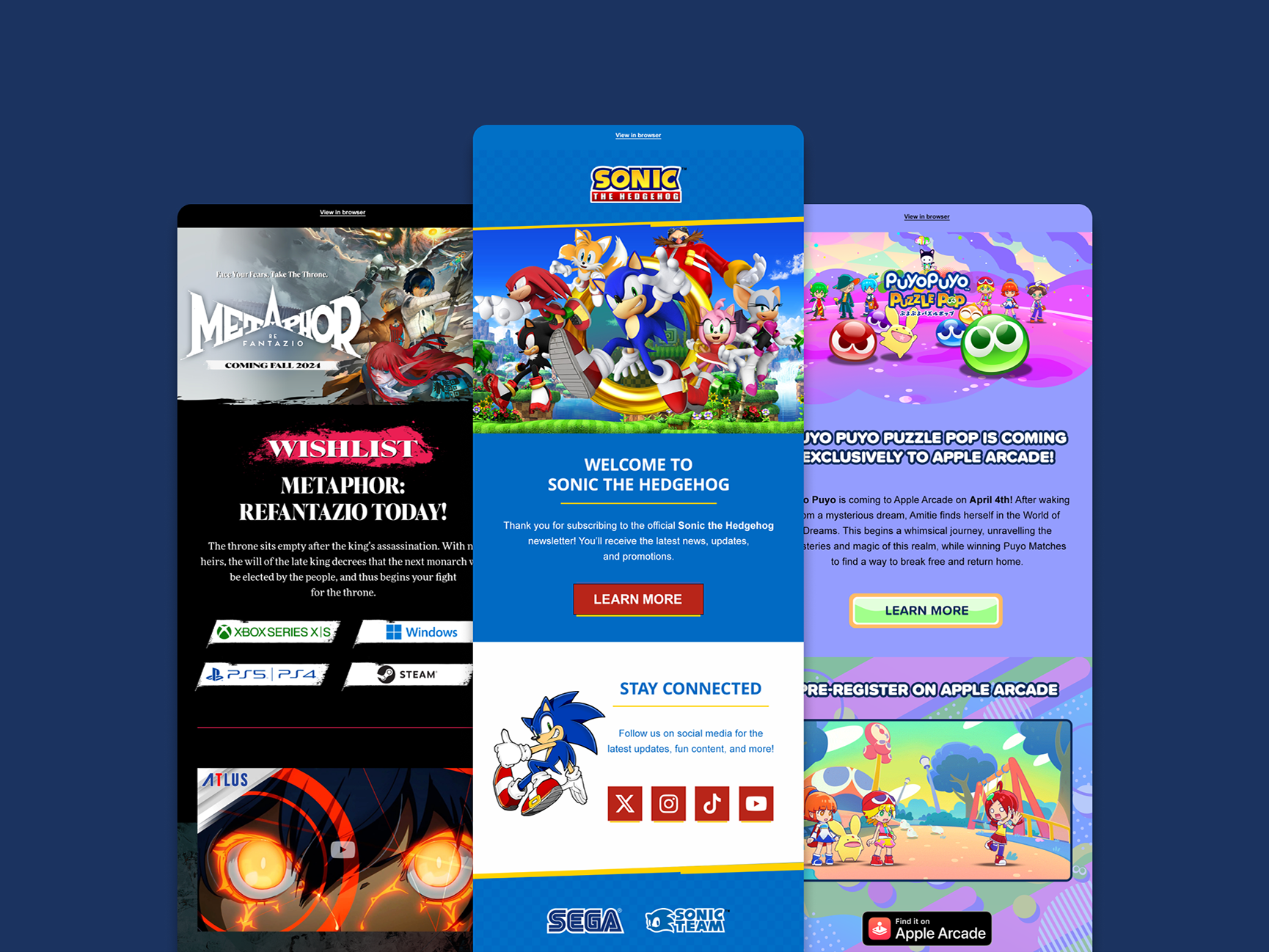
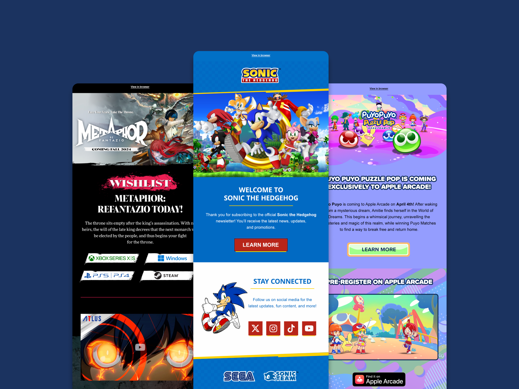
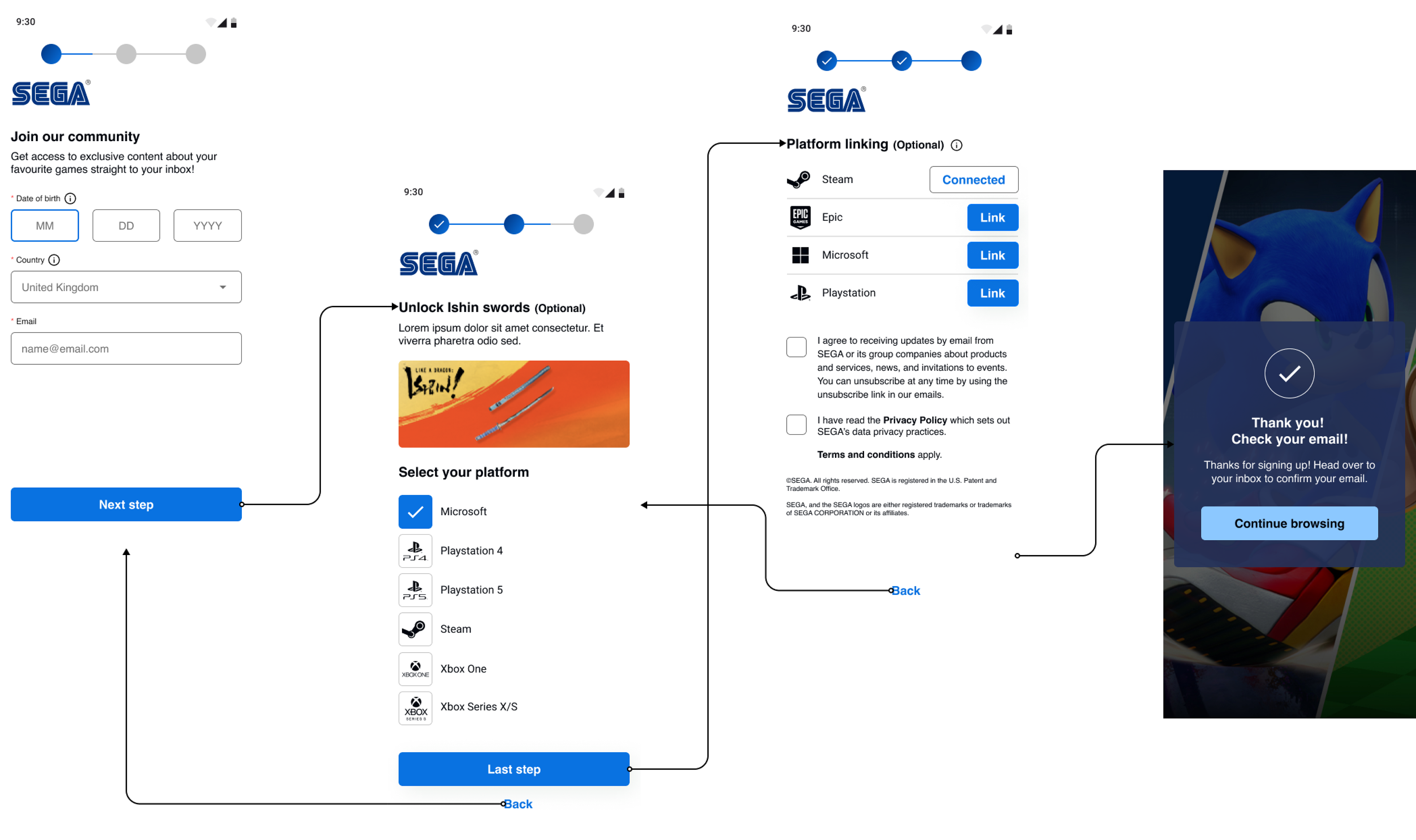
High-fidelity mobile mock ups
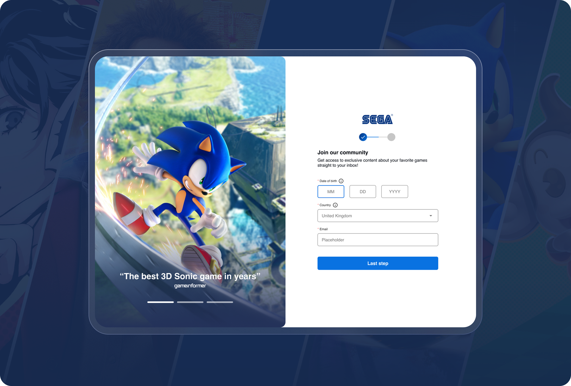
High-fidelity tablet mock ups
Accessibility considerations
During the design process I checked all the branded elements passed on contrast using the webAIM contrast checker.
I made sure that all icons being used throughout the UI designs had labels so users are not just reliant on colour to account for colour blindness.
Next steps & takeaways
If I were to advance the project to the next step, I would like to: Conduct another round of usability studies to validate whether the pain points users experienced have been effectively addressed.
Overall, the redesign of SEGA's new sign-up form highlights the importance of a user-centered approach, iterative design process, consistency in design, mobile responsiveness, clear communication, in creating a successful digital experience.
Overall, the redesign of SEGA's new sign-up form highlights the importance of a user-centered approach, iterative design process, consistency in design, mobile responsiveness, clear communication, in creating a successful digital experience.